
Activity - Data Visualization#
import pandas as pd
import matplotlib.pyplot as plt
import seaborn as sns

sns.set_theme(style="darkgrid")
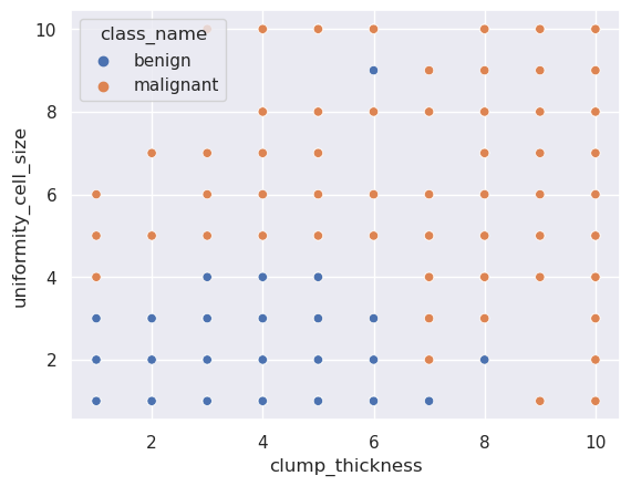
We will use the breast cancer dataset for this activity. The main goal is to create visualization for finding the attributes that could predict or classify the type of tumor.
Attribute |
Domain |
|---|---|
Sample code number |
id number |
Clump Thickness |
1 - 10 |
Uniformity of Cell Size |
1 - 10 |
Uniformity of Cell Shape |
1 - 10 |
Marginal Adhesion |
1 - 10 |
Single Epithelial Cell Size |
1 - 10 |
Bare Nuclei |
1 - 10 |
Bland Chromatin |
1 - 10 |
Normal Nucleoli |
1 - 10 |
Mitoses |
1 - 10 |
Class |
(2 for benign, 4 for malignant) |
More details here.
breast_cancer_data = pd.read_csv(
    "https://archive.ics.uci.edu/ml/machine-learning-databases/breast-cancer-wisconsin/breast-cancer-wisconsin.data",
    names=[
        "code",
        "clump_thickness",
        "uniformity_cell_size",
        "uniformity_cell_shape",
        "marginal_adhesion",
        "single_epithelial_cell_size",
        "bare_nuclei",
        "bland_chromatin",
        "normal_cucleoli",
        "mitoses",
        "class",
    ],
    index_col=0
)
breast_cancer_data.head()
| clump_thickness | uniformity_cell_size | uniformity_cell_shape | marginal_adhesion | single_epithelial_cell_size | bare_nuclei | bland_chromatin | normal_cucleoli | mitoses | class | |
|---|---|---|---|---|---|---|---|---|---|---|
| code | ||||||||||
| 1000025 | 5 | 1 | 1 | 1 | 2 | 1 | 3 | 1 | 1 | 2 |
| 1002945 | 5 | 4 | 4 | 5 | 7 | 10 | 3 | 2 | 1 | 2 |
| 1015425 | 3 | 1 | 1 | 1 | 2 | 2 | 3 | 1 | 1 | 2 |
| 1016277 | 6 | 8 | 8 | 1 | 3 | 4 | 3 | 7 | 1 | 2 |
| 1017023 | 4 | 1 | 1 | 3 | 2 | 1 | 3 | 1 | 1 | 2 |
Just for this time we will drop the bare_nublei column.
breast_cancer_data.dtypes
clump_thickness                 int64
uniformity_cell_size            int64
uniformity_cell_shape           int64
marginal_adhesion               int64
single_epithelial_cell_size     int64
bare_nuclei                    object
bland_chromatin                 int64
normal_cucleoli                 int64
mitoses                         int64
class                           int64
dtype: object
breast_cancer_data.drop(columns="bare_nuclei", inplace=True)
breast_cancer_data.dtypes
clump_thickness                int64
uniformity_cell_size           int64
uniformity_cell_shape          int64
marginal_adhesion              int64
single_epithelial_cell_size    int64
bland_chromatin                int64
normal_cucleoli                int64
mitoses                        int64
class                          int64
dtype: object
And let’s add a categorical column with the type of tumor.
class_dict = {2: "benign", 4: "malignant"}
breast_cancer_data["class_name"] = breast_cancer_data["class"].map(class_dict)
breast_cancer_data.head()
| clump_thickness | uniformity_cell_size | uniformity_cell_shape | marginal_adhesion | single_epithelial_cell_size | bland_chromatin | normal_cucleoli | mitoses | class | class_name | |
|---|---|---|---|---|---|---|---|---|---|---|
| code | ||||||||||
| 1000025 | 5 | 1 | 1 | 1 | 2 | 3 | 1 | 1 | 2 | benign |
| 1002945 | 5 | 4 | 4 | 5 | 7 | 3 | 2 | 1 | 2 | benign |
| 1015425 | 3 | 1 | 1 | 1 | 2 | 3 | 1 | 1 | 2 | benign |
| 1016277 | 6 | 8 | 8 | 1 | 3 | 3 | 7 | 1 | 2 | benign |
| 1017023 | 4 | 1 | 1 | 3 | 2 | 3 | 1 | 1 | 2 | benign |
For example,
sns.scatterplot(
    data=breast_cancer_data,
    x="clump_thickness",
    y="uniformity_cell_size",
    hue="class_name"
)
<Axes: xlabel='clump_thickness', ylabel='uniformity_cell_size'>
Your turn!